Why Google Prefer Mobile Site ?
mobile site is changing the world. Today, everyone has smartphones with them, constantly communicating and looking for information. In many countries, the number of smartphones has surpassed the number of personal computers; having a mobile site-friendly website has become a critical part of having an online presence.

Why make a website mobile-friendly?
The desktop version of a site might be difficult to view and use on a mobile device. Users find this a frustrating experience and are likely to abandon the site. Alternatively, the mobile-friendly version is readable and immediately usable.
How can I check if my site is mobile-friendly?
You can check your site by testing your pages with the Mobile-Friendly Test tool. This tool shows how Google Search sees your pages. To get a list of mobile usability issues across your sites, log in to your Search Console account and use the Mobile Usability Report.
How can I make my site mobile-friendly?
Get started with the guide to mobile-friendly sites to build your mobile-friendly site. If you need more customized advice for publishers, you can check out the Ad Sense Multi-Screen Starter Guide.
Three Methods of Smartphone Mobile Site Design
Google says there are three basic configurations when going mobile, however they do seem to strongly recommend going with the responsive design approach.
- Website Sites that use responsive web design.
- It’s that also serve all devices on the same set of URLs, but each URL serves different HTML (and CSS) depending on whether the user agent is a desktop or a mobile device.
- WebSites that have a separate mobile and desktop sites.
Mobile Configurations
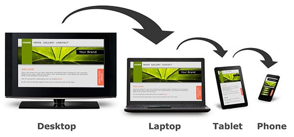
- Responsive Design. Often referred to as “RWD” for Responsive Web Design, this design approach uses fluid, a part based grids, flexible images and varying CSS style rules to deliver different user experiences to desktop, tablet and mobile devices while maintaining the same HTML and URL structure. The site shrinks or grows according to device.
- Adaptive Design. The site has multiple versions that are served through common URLs.
- Separate Mobile Site. Sometimes referred to as mDot (“m.”), this configuration delivers different HTML on separate URLs depending on the device detected. The usual arrangement is to have the desktop site located on the www subdomain and the mobile-friendly site’s pages located on the “m.” subdomain.