Know how an Adaptive website is different from a Responsive Website!
Is your business website adaptive? Or is it responsive? Between these two, which is effective and most useful design style for your business needs? This is a common question we are asked and as a top web design firm, we wanted to discuss the topic a bit. It is important to understand the difference between responsive and adaptive web design to ensure that your site will perform optimally and have the highest engagement and conversion rates possible to maximize online success. Both styles of design are useful for connecting with users on different sized screens which can lead to some confusion. While they do share similarities, there are also very clear differences.
Know what type of business style you follow, Adaptive or Responsive?
But before that, it is important to understand the difference between an adaptive and responsive web design to make sure that your website will performance is optimal and having the highest engagement and conversion rates.
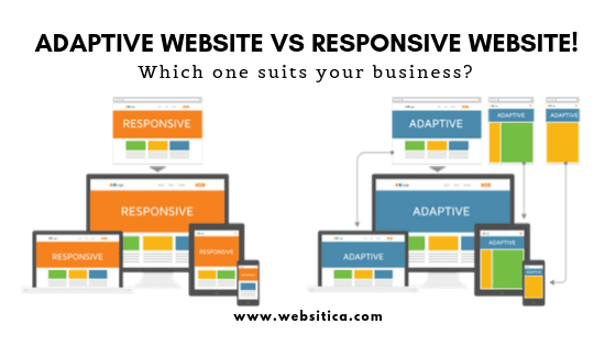
Responsive Web design is a feature that allows a website to be properly displayed on various screen sizes with a correct fitting of the content. The page will fluidly adjust according to the features and device used by the user.
Adaptive Web design works by making use of multiple fixed layout sizes based on customer requirements. This considers various options like space availability and selects layouts that fit the best. This also adjusts the size of the browser window without affecting the site’s appearance.
Which is better, Responsive or Adaptive?
Both designs are considered superior and each has a Stand-alone Desing, without changes in the screen size. However, there are a few pros and cons associated with the methods.
Responsive Design – Pros & Cons.
Pros –
– The design is the same across all the devices creating uniform experience.
– Search Engine Optimization friendly.
– There are n number of templates and layouts which can be incorporated
– Easy to implement.
Cons –
– The Screen size design is designed for only a few devices control and is commonly built for mobile-first and then expand to fit desktops.
– Advertisement placement is not fixed permanently
– Load times problem arises on mobile devices.
Adaptive Design Pros & Cons.
Pros,
– This helps in concentrating on the best user experience only to limited screen type.
– This automatically senses the user’s environment.
– This allows maximum advertisement placements if the website aims at it.
Cons,
– It consumes a lot of time and energy to create.
– It doesn’t go well with tablets and netbooks due to varying screen sizes
– It requires additional SEO work for search engines to rank them.
Hence the bottom line is that, knowing the difference between a responsive and adaptive web design. It absolutely the client’s choice in choosing the right website design for their business. Each has its own advantages and disadvantages and some business goals and users personas to attract. So, the consumer has to the best user experience and conversion rate for a business.
If you want to any help in Website redesign Service, We are glad in helping you.
Call us – +917601976099 | Mail us – [email protected]
Check Out These Related Posts
5 Important Things to know before developing an Mobile App.
Taking your business to the next level? Planning for building a mobile app for your business? But there are few crucial factors before getting started with Mobile App Development.Do you know?Approx. of over 2.32 billion mobile users are present worldwide...
How can a Web design influence your Potential leads?
How can a Web design influence your Potential leads?Having a web design is vital in an organisation, because many of the potential customers, But having a good looking website is not the only criteria , But this works as an effective lead generator,which...
Now reach the top of Search Engine with SSL certificate integration!
When a website's URL starts with "https" it directly indicates that the website has SSL Encryption/ Certificate and it's safe to transfer sensitive information over the website.Also when SSL is installed, you show a guarantee to your website visitors...
Follow us


