Before getting into website revamp, website optimization and all, Did the question of “why do you really want a website” or ” how does website serve its purpose?” arise in you!! This piece of content is all about the website utility and purpose of having a website.
Website usability firstly observed using the first-hand experience for visitors, right from the appearance and design itself to the navigation set-up, speed and how the information/products are displayed, is for potential customer engages with the website.
The main aim of creating a website is to attract a potential customer so it serves the purpose of attracting a customer to your business. SO when a website represents your business with poor usability, then it is a bad service rendered from the customer’s perspective.
Lets put into consideration, the important questions for having an online business.
– What is the main function does your website serve? The industry which you belong to and currently operating in, the service you provide and various other factors.
It may be that your website will be used by visitors to interact with each other, it may be for visitors to buy tickets to an event, to purchase products or its purpose may be to simply provide information about your business.
– Keep the design up to date.
Keeping the user updated and user-friendly is most important for user interaction. If the content is cumbersome for visitors to get the information that they’re after, especially if accessing from certain devices.
Using the different sized desktop monitors, laptops, smartphones and tablets that can be used to access the internet, all have to be responsive to the better user interface.
This enables the website to resize and reshape itself to fit whatever screen it shows up on, is the must factor for competitive websites these days and is crucial to ensure a quality UX interface.
How Easily Can Information Be Found?
In the online marketing world, the requirements of a perfect website keep changing in a short while and these changes take place for making the visitor to a customer and to enhance the business with a better consumer experience.
The revolution of the responsive website came recently until then every website was non-responsive
Making your navigation easy!
The next debatable topic about the website is that it should be easily navigated within 3 clicks. however, the ideas have changed for the fact that websites have significantly more content nowadays.
Stuffing a lot of content on your website with a lot of subcategories will make your website hate by the customer. And you want this to happen in your dreams also. So navigating to other pages in an organized and categorized way can create great impressions among audiences.
Hence this article covers only the basic considerations which are a few droplets from an ocean of information, making sure in having a double check can help you greatly in client conversion.
If you want to any help in Web Designing for your business, We are glad in helping you.
Call us – +917601976099 | Mail us – [email protected]
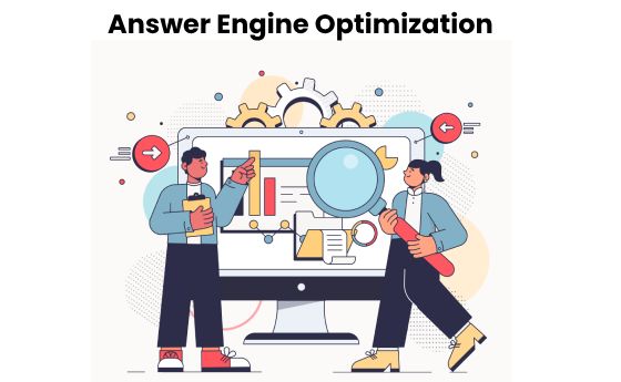
The Future of Online Visibility: Why Websitica Focuses on AEO ( Answer Engine Optimization )
In the rapidly evolving digital landscape, traditional Search Engine Optimization (SEO) is no longer enough to ensure your website stands out. The new frontier in digital marketing is Answer Engine Optimization (AEO)—a shift towards optimizing for answers rather than...
Why Websitica Technologies is the Best Web Designing Company in Chennai
In today’s digital-first world, a professional, high-performing website is the foundation of any successful business. As a pioneer in web design, Websitica Technologies has consistently delivered top-tier websites tailored to meet the unique needs of businesses in...
Staying Ahead of the Competition with WebSitica’s AI-Assisted Website Optimization
At Websitica, we understand the importance of having a website that is optimized for both search engines and user experience. That's why we offer a unique service that utilizes the power of Artificial Intelligence (AI) to improve your website's performance. One of the...


