The overall purpose of every website is conversion and it can sometimes be a sale, but mostly they occur when you collect a lead.
A proper website can point out all your visitors to one place, your contact form.
However it easy to direct the horse to a direction but it’s difficult converting it.
Well, we have put together 10 Tips for Creating a Contact Form that Converts.
Create a Contact Form that Converts
#1 – Limit the No. of Fields
Research suggests that by reducing a form to just four fields, the conversion rate increased by 150%, and decreasing one more the conversion rate increased by 17%.
Because people don’t have time to fill out complex forms and many are shy about giving you all their information up front.
Instead, it works better if you can get them in concise to 3-4 fields to attract eyeballs.
#2 – Reducing the No. of *Required Fields*
Required are important for framing the converting contact form.
Many visitors aren’t interested in giving their details suspecting for a spam call.
Studies reveal by eliminating that *required phone number, conversions increased by 275%.
So, when formating a contact form that converts, make sure you only require the essentials.
# 3– Indicate Errors in Submission clearly.
Nothing is so irritating than to fill out a form and get back an error message.
It creates hatred and a lot of effort to get back to the form.
Keep them moving forward, not backward in the process.
Using HTML5 or JavaScript to flag a solution when the problem occurs.
This is easy and reduces the friction between the visitors.
#4– Don’t Default to Text Fields
You must create a proper data fields for the contact form that converts.
Use phone number data field for the phone number and the required data fields for the inputs
Because half of all the research is being made on mobile devices.
#5 – Using ONE Form Instead of Multiple Forms
There will be times where you have to collect a large amount of information.
At that due point, only 3 data fields just won’t cut it.
The research suggested that A/B study of a single-page checkout and one where the forms were shorter but fell on two pages.
The conversion was much higher for the single page than the two shorter forms.
So while creating a contact page that converts, only ask for information you need and put it all in a single page contact form.
Creating a contact form that converts is essential to the success of any website and the business.
If you find that visitors are not being funneled to your contact form or that they are abandoning without conversion, then this can be the permanent solution.
Call us – +917601976099 | Mail us – [email protected]
Don’t repeat this 5 WordPress mistakes while creating Website
Making errors are common, but make sure you don't make these 5 killing errors in the future if you are working with WordPress.So, rather than repeating the mistakes, we can use this as an eye-opener to use WordPress more intelligently rather than making common...
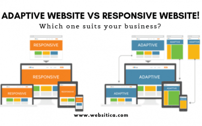
Know how an Adaptive website is different from a Responsive Website!
Know how an Adaptive website is different from a Responsive Website! Is your business website adaptive? Or is it responsive? Between these two, which is effective and most useful design style for your business needs? This is a common question we are asked and as a top...
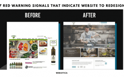
7 Red warning Signals That Indicate Website to Redesign
The website is the primary artery in showing up about your business and connecting with your potential buyers. If you feel that the website is obsolete, then it's time to revamp your website.But if you are unaware of the fact that the website is obsolete, then these 7...


