The overall purpose of every website is conversion and it can sometimes be a sale, but mostly they occur when you collect a lead.
A proper website can point out all your visitors to one place, your contact form.
However it easy to direct the horse to a direction but it’s difficult converting it.
Well, we have put together 10 Tips for Creating a Contact Form that Converts.
Create a Contact Form that Converts
#1 – Limit the No. of Fields
Research suggests that by reducing a form to just four fields, the conversion rate increased by 150%, and decreasing one more the conversion rate increased by 17%.
Because people don’t have time to fill out complex forms and many are shy about giving you all their information up front.
Instead, it works better if you can get them in concise to 3-4 fields to attract eyeballs.
#2 – Reducing the No. of *Required Fields*
Required are important for framing the converting contact form.
Many visitors aren’t interested in giving their details suspecting for a spam call.
Studies reveal by eliminating that *required phone number, conversions increased by 275%.
So, when formating a contact form that converts, make sure you only require the essentials.
# 3– Indicate Errors in Submission clearly.
Nothing is so irritating than to fill out a form and get back an error message.
It creates hatred and a lot of effort to get back to the form.
Keep them moving forward, not backward in the process.
Using HTML5 or JavaScript to flag a solution when the problem occurs.
This is easy and reduces the friction between the visitors.
#4– Don’t Default to Text Fields
You must create a proper data fields for the contact form that converts.
Use phone number data field for the phone number and the required data fields for the inputs
Because half of all the research is being made on mobile devices.
#5 – Using ONE Form Instead of Multiple Forms
There will be times where you have to collect a large amount of information.
At that due point, only 3 data fields just won’t cut it.
The research suggested that A/B study of a single-page checkout and one where the forms were shorter but fell on two pages.
The conversion was much higher for the single page than the two shorter forms.
So while creating a contact page that converts, only ask for information you need and put it all in a single page contact form.
Creating a contact form that converts is essential to the success of any website and the business.
If you find that visitors are not being funneled to your contact form or that they are abandoning without conversion, then this can be the permanent solution.
Call us – +917601976099 | Mail us – [email protected]
Killer offer for your Web service business!
The ultimate goal of every website is to attract qualifying leads. Your business is nothing without your leads. Many think about the inorganic ways like SEO, paid advertising, content marketing, and the website content will increase the leads but what it does actually...
6 Website design trends, you need to know!!
Web design changes instantly which results in easy outdated features, hence if you come to know that your website is 3-5 years old then it's time to redesign or get back to trend.Here these pieces of content will let you know the latest trends in website Design...
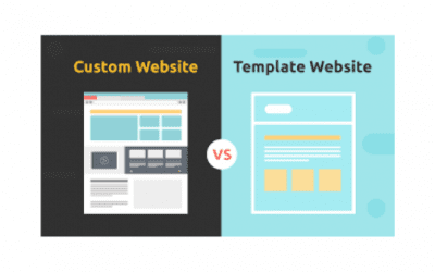
Which is easy to handle, Custom vs Template Website?
There is always a concept which is called " Phantom Deliverables".The idea is that company delivers products or services which their clients never asked for.But what's more important is that it should be easy for them to update with the adequate resources they have....


